
DISCLAIMER: The following review involves my personal opinions and is in no way meant to promote or defame any of the products I mention. I am in no way affiliated with the brand(s) and am not being paid to promote any goods. The copyrights on the products remain with the brand(s) and this review is merely a culmination of my personal experiences with the material.
Alrighty, children, time for another review! This one’s about a graphite set that was, once again, gifted to me. I’ve had it for over a year now and never bothered to give it a go until recently, and boy was I impressed!
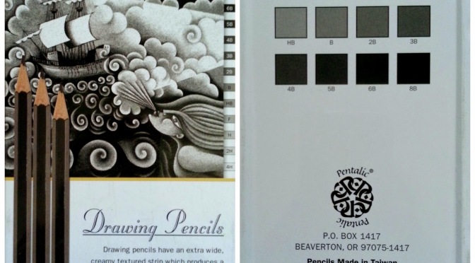
The graphite I’m talking about is the Pentalic Sketch Pencil Set and here’s what the tin looks like:

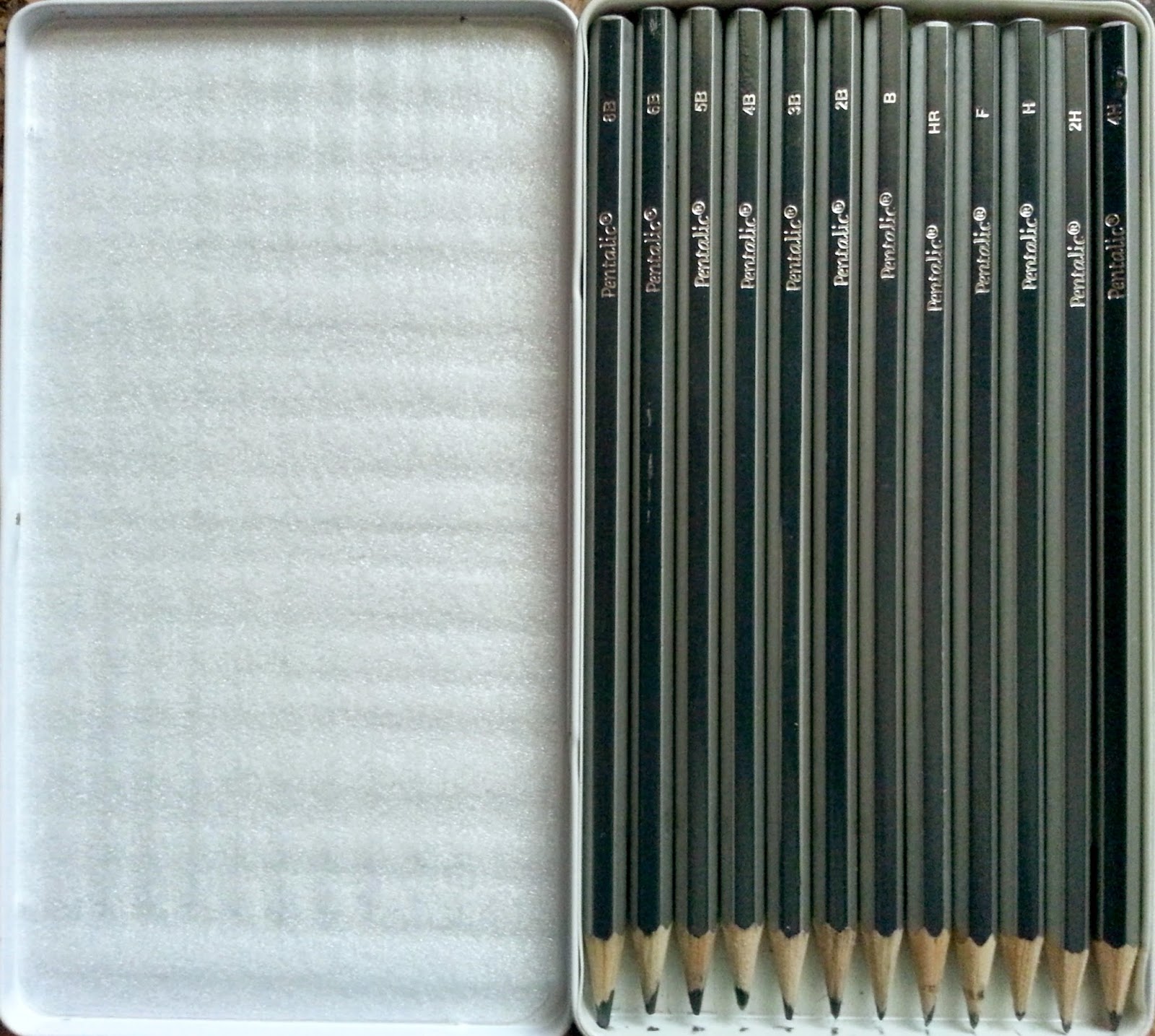
Yes, the pencils are upside-down. I was just as baffled as you are! Anyway, this set contains- surprise, surprise- twelve grades of pencils: 4H, 2H, H, F, HB, B, 2B, 3B, 4B, 5B, 6B and 8B. This shade range covers the basics and is more than enough to create a complete graphite piece. However, this means there are no multiple copies of the most used tones. Then again, given a choice between a wide shade range and copycat pencils, I’d always pick the former.
On to the swatch:
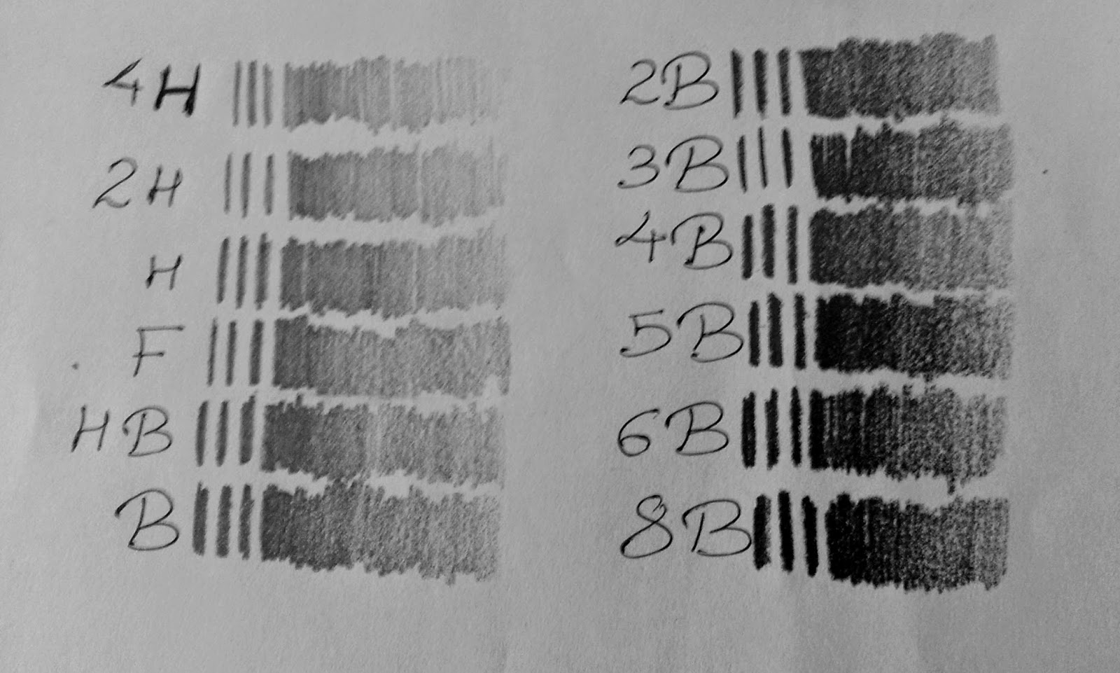
In terms of quality, these pencils are some of the best I’ve ever used. They go on smooth and do not get scratchy and streaky, which improves the overall quality of the drawing- a very good set if you’re into hyperrealism. On the flip-side, however, after a few thin layers, they create this almost-patina, which makes it very difficult to add details since the tooth of the paper is sacrificed. I personally like a bit of a texture to my paper, so this put me off a tiny bit. 😦
The rest of this review will involve 4 prominent tones- 2H, HB, 4B and 8B, since they represent each section, so to speak, of the shade range.
Blend-ability?
Below is an image that shows just how well these blend, using a clean blending stump.

The transitions are almost seamless, but there is noticeable lightness in the blended areas. Quite a bit of the graphite gets lifted off easily, which makes layering rather mandatory, and that eventually leads to the whole “patina” mess. You get the idea- hyperrealism: yes; toothy paper: not so much.
So on a scale of one to food processor, these would probably equate an electric whisk- the blending is brilliant, but the texture is altered completely.
Getting rid of the evidence:
Now we move on to one of the most important aspects of a graphite review- erasability. I call it important because there is literally no way I can draw without an eraser, and I’m not just talking about adding highlights. ![]()

I was actually quite impressed with how well these erase off, but not surprised in the least- remember how the blending stump lifted so much graphite off so easily? Of course the darker tones leave behind some residue, but it’s still a whole lot lesser residue than most other brands and for that, I’m grateful.
Clearly, these show the “drag” phenomenon we spoke of on the Derwent Coloursoft review. Without elaborating too much on this, I must mention that it gets slightly tough to draw lighter eyes if you’ve made a mistake in the iris shape. You have to force yourself to erase in the same direction as the shape (in this case, a circle, which is significantly hard) or the lighter details will be completely and utterly ruined. >.<
Prices and Comparisons:
I know what the big question is- how much do these puppies cost? Now as I mentioned before, I was gifted this set (as well as two others which I’m yet to use) but I looked it up on Amazon and it costs about $7.70. This is quite good, compared to the Derwent Graphic tin of 12, which has a smaller shade range (4H-6B) and costs about $13.21, which is just shy of twice the price! (I do have a review on the Graphic 24 tin, so check that out as well!)
Let’s compare the two side-by-side, shall we?

There is no visible difference. (The Pentalic swatches look a tiny bit lighter due to the glare, but that can be attributed to the smoothness of the graphite.) There is, however, a bit of a difference in the textures. Again, the Pentalic pencils are a whole lot smoother and we’ve already discussed the pros and cons of this, but the Derwent pencils, while brilliantly preserving the tooth of the paper, do have a tendency to go slightly streaky from time to time, in that little flecks of graphite get stuck on the tooth of the paper and refuse to budge! In this aspect, Pentalic is a clear winner as far as I’m concerned.

Same thing with the 8B for Pentalic and Derwent, but I also added in the Staedtler Lumograph 8B, just to provide you guys with a frame of reference in terms of shade and smoothness. The Staedtler made an appearance in the Derwent 24 Graphic review, and the nails-on-the-chalkboard feeling remains unaltered. *shudders violently*
So, to summarize, here are some numbers for you left-brained ones:


Reblogged this on Dem Bones.
LikeLike
EFL Geek,Just curious: are you a scout for your unyrtvsiei? What’s your department like? How many teachers are in it? What sort of package can your university offer? Will you still be working where you are after I’m done with my walk?Please send me an email. As the New Yawkas say, We’ll tawk.Kevin
LikeLike