Tag Archives: paints

Tutorial: How To Paint Loose Curls In 12 Easy Steps!

Artists hate curls. It’s a simple fact.

Ask anyone who has ever painted hair, and they’ll almost always say they prefer to render straight or wavy hair. It’s so much easier, and doesn’t make you want to pull your own hair out!  (See what I did there? Do ya???)

Continue reading Tutorial: How To Paint Loose Curls In 12 Easy Steps!

Watercolour Painting for Acrylic Artists: Mixing It Up

Just a quick note before we start: I’ve decided that, though this series will be written in a logical order, I’m going to try to also make sure every post can stand alone. However, if you’d like to read it in order, check out the first post!

Continue reading Watercolour Painting for Acrylic Artists: Mixing It Up

Watercolour Painting for Acrylic Artists: The Basics (+ Sakura Koi Water Color Field Sketch Travel Kit Mini-Review)

This post is not affiliated with or sponsored by any of the brands mentioned. All opinions are my own.

If you’ve followed my work for a while, you’ll know that when it comes to art, I’ve somehow always managed to learn things backwards. I started drawing faces before I learned to draw individual features, I learned to shade before I perfected my lineart. So naturally, I worked with acrylic paints way before watercolours even entered my life.

Confident (or at least praying) I’m not the only one to work like this, I’m hoping this series of posts will help all you over-achieving artists like myself, who try to fly before they learn to walk! Watercolours and acrylic paints could work to achieve similar end-results, but the processes are entirely different, and this post aims to tell you why.

First, let us break down the very basics of both, acrylic and watercolour painting:

  • Watercolours consist of pigment particles bound by gum arabic, which is made of hardened sap. This basically adheres the pigments to each other and to the painted surface.
  • Acrylic paints follow a similar principle, except the binder is acrylic polymer.
  • Both types of paints can be thinned by water, though watercolours are obviously much more soluble than acrylics.
  • As with acrylics, you get both student- and artist-grade watercolours. However, while a higher quality of acrylic paints usually refers to better pigmentation, you can still get artist-grade watercolours without adding unwanted opacity.
  • More opaque watercolours are usually referred to as Gouache, but we won’t go into that here (mostly because I haven’t tried that method out yet!).
Watercolours come in both, cakes and tubes. However, having experienced immense amounts of wastage with acrylic paint tubes (*cough*MyPoorPalette*cough*), watercolour cakes were most definitely the best choice for me.
My current watercolour kit (that I’m absolutely loving, by the way) is the Sakura Koi Water Color Field Sketch Travel Kit (24 shades). While that’s a mouthful, this kit is incredibly handy! As pictured below, it comes with 24 cakes of watercolour, a detachable palette, two sponges, and a (barely visible in this shot) waterbrush. Admittedly, I pulled the picture below from my Instagram, and it is from a while ago when my palette was still quite green. By that I mean I still had the outer cover.


These are definitely one of the higher-end student grade watercolour sets, but definitely well worth the money. It has been specifically designed for plein-air work, and is thus convenient to carry around with you. I love that the shade range is rather realistic, in that I can definitely see myself using all of these colours at least a couple of times in my work….or perhaps it’s my painting style that has evolved to involve more colour…. Either way, below is a swatch sheet of all the colours in natural daylight (post-processed slightly to get the colours as close to real as possible). Zoom in for the shade names!

I must admit, I have always grown up a scientist. As is seen in a lot of my drawings, the technical aspects of art come a lot more easily to me than abstraction. If something doesn’t make universal sense, it probably has no place in my work. So, of course, when it comes to comparing two media of art, I was obsessive about try to make it a fair comparison.
I started by grabbing a couple of tubes of acrylic paint that had identical namesakes in the watercolour kit. These, for me, were Cadmium Red Hue and Viridian Hue. I swatched out two circles split into quarters, one with watercolours and the other with acrylics. I also looked at the effects of layering the paints on, and this is what I found:
Before we go any further, I would like to mention that right now is when I realised just how much of a difference is made by the paint quality. Both the acrylic paints I used are student grade, but from different brands. The Viridian is so much sheerer than the Cadmium Red, it’s almost funny! Lesson learned: a lower price almost certainly guarantees a trade-off in terms of pigmentation. 😦
Now clearly, the acrylics are, overall much more opaque than the watercolours, but what’s worth noting is that with enough layering, watercolours can most definitely achieve an opaque enough look. That being said, these have been swatched on paper. It probably wouldn’t be a similar case with primed canvas, which is great for thicker acrylic paints, but would barely hold on to anything so watered down.
Next, I tested the water solubility of both. Admittedly, the colours below aren’t identical, but they are similar enough to be comparable.
What you’ll notice instantly is that the acrylic swatch (right) is much streakier than the watercolour swatch. This, as I mentioned before, is because the gum binder in watercolours is much more water soluble than the polymer in acrylic paints. I should also mention that both these swatches were wet paint on dry paper, and I added some extra water about halfway through the circle.
Now as an acrylic artist, the concept of dipping into water before swiping over paint, to get more pigmentation even, is going to seem strange (unless, of course, you’re using watercolour tubes, in which case I bow down to your superior tube-squeezing skills). With acrylics, I mostly only use water to wash my brushes, and occasionally to thin paint enough so it can be poured on to the canvas directly.
The other novel thing about watercolours for me was the way they dry.


If we look closer at this half of the previous (watercolour) swatch, there are a few visible streaks. Funnily enough, this is not because the paint applied unevenly. Usually with acrylics, though the paint dries really quickly, it is still workable when wet. Watercolours do this thing where the paint sets into the paper in the blink of an eye, even if the paper is still wet. The fibres in watercolour paper trap the water really well (hence why this paper is specifically manufactured in the first place), which means that while it adheres the pigment beautifully, it does take a bit longer for the water itself to evaporate. This means that if you outline your shape first  and then go back for more colour to fill it in (which I clearly did here. Rookie mistake, Srish!), the outline might have set, and the new colour will apply like a new  layer, making the edges of the outline appear darker and uneven. If you’re trying to create realistic art with watercolours, this can be a huge bummer. However, here are a couple of tips that help me avoid this kind of kerfuffle:
  • The best thing to do would be to try a wet-on-wet technique to begin with, where you fill the shape in with water first, then go over it with paint. We’ll discuss this in more detail in a future post.
  • An alternative would be to use a lower water-to-paint ratio on the second layer, so that all of it is  significantly more opaque, and you can’t really see the edges so much. However, this can often take away from the airy, care-free feel that most artists seek from watercolours.
  • Finally (and this is my least favourite method) you can go in with a wet brush that has no colour on it, or a damp sponge or tissue, and try to rub the edge out before quickly going over it with more paint. The reason I don’t like this technique is because, as I mentioned before, the paper is usually still wet, and adding friction to wet paper can cause it to peel off or tear. Not an effect anyone is ever really going for!
Watercolours bring with them an amazing freedom for creativity which, for someone as structured as I am, is a huge craving. While acrylic paints help you grow as an artist due to their amazing flexibility of usage, watercolours encourage you to simply play with colours in their purest form. If this hasn’t convinced you to try them out, here’s a super cool watercolour effect that is difficult, if not impossible, to create with acrylics:
So these are some of the basic things I learned about watercolours, as someone who has spent years loving (and sometimes ruing) acrylic paints. I do hope this was a good read, and I would definitely love to hear any similar experiences you might have had! And finally, here’s a piece that I completed using this watercolour kit (and some white acrylic paint for the stronger highlights): WARNING FOR POSSIBLE GORE!
Sakura Koi kit: http://sakuraofamerica.com/component/product/products/412
Get in touch with me via Facebook, Twitter or Instagram!
Thank you ever so much for reading, and I’ll see you on the next one!
-S.

Product Review: Pentalic Sketch Pencils- Set of 12

DISCLAIMER: The following review involves my personal opinions and is in no way meant to promote or defame any of the products I mention. I am in no way affiliated with the brand(s) and am not being paid to promote any goods. The copyrights on the products remain with the brand(s) and this review is merely a culmination of my personal experiences with the material.

Alrighty, children, time for another review! This one’s about a graphite set that was, once again, gifted to me. I’ve had it for over a year now and never bothered to give it a go until recently, and boy was I impressed!

The graphite I’m talking about is the Pentalic Sketch Pencil Set and here’s what the tin looks like:

Yes, the pencils are upside-down. I was just as baffled as you are! Anyway, this set contains- surprise, surprise- twelve grades of pencils: 4H, 2H, H, F, HB, B, 2B, 3B, 4B, 5B, 6B and 8B. This shade range covers the basics and is more than enough to create a complete graphite piece. However, this means there are no multiple copies of the most used tones. Then again, given a choice between a wide shade range and copycat pencils, I’d always pick the former.

On to the swatch:

As I mentioned before, the shade range is absolutely perfect and this makes me a very happy artist! Also, as is seen on the gradients, each tone is really versatile, in that a single pencil can be used to create a variety of shades. I haven’t the faintest how that works (apart from the obvious “you’re using different pressures, you numpty!”), but it means that you don’t have to reach for a different pencil for each little detail, so it saves a whole load of time.

In terms of quality, these pencils are some of the best I’ve ever used. They go on smooth and do not get scratchy and streaky, which improves the overall quality of the drawing- a very good set if you’re into hyperrealism. On the flip-side, however, after a few thin layers, they create this almost-patina, which makes it very difficult to add details since the tooth of the paper is sacrificed. I personally like a bit of a texture to my paper, so this put me off a tiny bit. 😦

The rest of this review will involve 4 prominent tones- 2H, HB, 4B and 8B, since they represent each section, so to speak, of the shade range.

Blend-ability?

Below is an image that shows just how well these blend, using a clean blending stump.

The transitions are almost seamless, but there is noticeable lightness in the blended areas. Quite a bit of the graphite gets lifted off easily, which makes layering rather mandatory, and that eventually leads to the whole “patina” mess. You get the idea- hyperrealism: yes; toothy paper: not so much.

So on a scale of one to food processor, these would probably equate an electric whisk- the blending is brilliant, but the texture is altered completely.

Getting rid of the evidence:

Now we move on to one of the most important aspects of a graphite review- erasability. I call it important because there is literally no way I can draw without an eraser, and I’m not just talking about adding highlights. :-/

I was actually quite impressed with how well these erase off, but not surprised in the least- remember how the blending stump lifted so much graphite off so easily? Of course the darker tones leave behind some residue, but it’s still a whole lot lesser residue than most other brands and for that, I’m grateful.

Clearly, these show the “drag” phenomenon we spoke of on the Derwent Coloursoft review. Without elaborating too much on this, I must mention that it gets slightly tough to draw lighter eyes if you’ve made a mistake in the iris shape. You have to force yourself to erase in the same direction as the shape (in this case, a circle, which is significantly hard) or the lighter details will be completely and utterly ruined. >.<

Prices and Comparisons:

I know what the big question is- how much do these puppies cost? Now as I mentioned before, I was gifted this set (as well as two others which I’m yet to use) but I looked it up on Amazon and it costs about $7.70. This is quite good, compared to the Derwent Graphic tin of 12, which has a smaller shade range (4H-6B) and costs about $13.21, which is just shy of twice the price! (I do have a review on the Graphic 24 tin, so check that out as well!)

Let’s compare the two side-by-side, shall we?

There is no visible difference. (The Pentalic swatches look a tiny bit lighter due to the glare, but that can be attributed to the smoothness of the graphite.) There is, however, a bit of a difference in the textures. Again, the Pentalic pencils are a whole lot smoother and we’ve already discussed the pros and cons of this, but the Derwent pencils, while brilliantly preserving the tooth of the paper, do have a tendency to go slightly streaky from time to time, in that little flecks of graphite get stuck on the tooth of the paper and refuse to budge! In this aspect, Pentalic is a clear winner as far as I’m concerned.


Same thing with the 8B for Pentalic and Derwent, but I also added in the Staedtler Lumograph 8B, just to provide you guys with a frame of reference in terms of shade and smoothness. The Staedtler made an appearance in the Derwent 24 Graphic review, and the nails-on-the-chalkboard feeling remains unaltered. *shudders violently*

So, to summarize, here are some numbers for you left-brained ones:

Price: 7.5/10.0 Not the cheapest, but more than worth the quality!
Range of tones: 8.0/10.0 Quite impressive, considering it is a 12 piece set.
Finish: 9.0/10.0 Smoothest and richest finish I’ve ever seen. It would’ve scored a full 10 if it also preserved the integrity of the paper.
Blending: 7.5/10.0 Seamless blending, but way too much graphite gets lifted off, and that is rather time consuming.
Erasability: 7.5/10.0 Very little staining, but the annoying “drag” puts me off a lot.
Final Verdict: 8.5/10.0
I’m quite impressed by these babies- they are brilliant, given the price, and seem like they’d last quite a bit!
Finally, here’s a piece where I’ve used these pencils:
 
 
See how amazing they are when it comes to hyper-realism? 🙂
I hope you’ve enjoyed reading this review as much as I’ve enjoyed creating it, and if you have any review/tutorial requests, please do comment below or on my Facebook, Twitter or Instagram to let me know, and I’ll look into it. 🙂
Have an amazing Sunday!
-S.

Product Review: Daler Rowney Simply Acrylic

DISCLAIMER: The following review involves my personal opinions and is in no way meant to promote or defame any of the products I mention. I am in no way affiliated with the brand(s) and am not being paid to promote any goods. The copyrights on the products remain with the brand(s) and this review is merely a culmination of my personal experiences with the material.

If you’ve been following me on Facebook or Tumblr, you’ll know that I’ve taken up using a new, magical, wonderful medium- Acrylic Paints! These are a lot more fun than pencils (Whoops! Don’t tell my pencils that!) because of this beautiful phenomenon called layering. What that means is simple: you can pile layers of paint on, choosing the intensity you want, and depending on the consistency of the paint, you can partially or completely hide the layers underneath. In even simpler terms, no erasing! If that isn’t a miracle, I don’t know what is!

So I decided I’d write a review on the very first set of acrylic paints I bought: the Daler Rowney Simply Acrylic set of 24. If we’re being completely honest, I picked these because “Daler Rowney” sounds a bit like Robert Downey Jr. and boy, is that an incentive! 

Iron Man aside, here’s what the box looks like.

Continue reading Product Review: Daler Rowney Simply Acrylic

Product Review: Derwent Coloursoft

DISCLAIMER: The following review involves my personal opinions and is in no way meant to promote or defame any of the products I mention. I am in no way affiliated with the brand(s) and am not being paid to promote any goods. The copyrights on the products remain with the brand(s) and this review is merely a culmination of my personal experiences with the material.

Colour pencils. These are tools that, if used well, can bring about magic. On the flip side, they can also bring some less-than-brilliant effects to the paper (trust me, I know!). So, I figured I’d share with you my opinions on the colour pencils I use- the Derwent Coloursoft 24 tin. (Do click on the images to enlarge them for a closer look.)

Here’s what my tin looks like:


Obviously, I use some colours more than the others *cough* Black *cough*, and the design on the cover varies from batch to batch. Also, the colours may not be in the same order as mine are; I’m a bit obsessed with organising according to colour.
Anyway, there’s a wide range of colours, and here’s what they look like on paper:
First of all, I like how the names are not all mystical in a way that gets annoying when you’re in a hurry to find the right colour: Lime Green is the colour of green limes! At the same time, the names aren’t drab, either. Dark Terracotta is such a fascinating name!
As you can see, the colours are rather pigmented and very vibrant. Almost every tone has at least two shades, which facilitates colour mixing, and is really very helpful when it comes to monotone drawings. (Okay, the white won’t show up on white paper. I just put it in there because it was a part of the set….and I may or may not have had an extra swatch slot.)
A great thing about these is that they sharpen to a fine point, making intricate work extremely easy.
On the other hand, the pencils are very soft and so need frequent sharpening. Hence, the size of my wee Black pencil!
How well do they blend?

I used a regular tissue to blend the ends of the swatch blocks into each other, and this is how it turned out.

Now as is visible, the colours that have been drawn out blend very well . That is to say, the colours blend well into each other, as long as they are in thin layers. The edges of the swatch blocks, however, are still visible, and that is a big disadvantage when it comes to these pencils. If you’re looking to blend, a light hand is very necessary, or it’s going to leave streaks everywhere!

I also made a colour wheel of sorts, using a blending stump this time.

On the outermost circle, I used the colours Red, Blue and Acid yellow, and blended them into one another. The inner circle included Royal Purple, Green and Bright Orange in addition to these. So, they blend well into each other, but the edges are still visible. It’s a pet peeve with me, having rough edges, so I pile thin layers of colour on, instead of going all out with the first stroke.

Another thing I’ve noticed about these is that once you’ve blended for a reasonable while, the colour turns glossy- that is to say, the tooth of the paper is lost. I’ve tried this on various types of papers, so I know it’s because of the pencils. This is fine if you’re done with that area, but can be a menace, should you want to add more colours on to that spot.

How well do they erase off?

Obviously, erasability is a very important criterion when it comes to pencils of any kind.

I used a blunt edge of a hard rubber eraser to rub off some of the colour, and this is what it turned out to look like:

The pencils erase off reasonably well, although they do leave a lot of residue. Although, considering colour pencils I’ve used in the past, these are miracles in wood casings! As is visible, however, they do this peculiar thing where they “drag”, so to speak. See those colour tracks between the swatch blocks? Those were made solely by erasing. Why is that so important? It is awfully annoying if you mess up a dark patch surrounded by lighter colours. The darker shade drags out into the lighter ones, and you have to erase all of it and start over. This happens if I draw the pupils wrong and the subject has light irises. Extremely troublesome! Again, thinner layers erase off completely, even with kneaded erasers, so the key to this is piling on thin layers!
Value for money

The prices online range anywhere from £32.00 to £34.00. As with most other Derwent products, these are expensive, but as with most other Derwent products, these also come in smaller sets of 6 and 12, which are cheaper. They also come in a specialised set of skin tones, which I might do a mini-review on later.

The 24 tin has some shades I don’t use very much- too many browns in there for me, and not enough blues! So if you’re just starting out with colour pencils, I’d probably suggest the smaller packs, or just buying individual shades you like.

Alright, time to do the math.
Here are a few ratings from 0 to 10, 10 being the best at a particular aspect:

Price: 5.0/10.0 Expensive, but given the wide shade range, I’d say it was almost worth it.
Range of tones: 7.0/10.0 As I said, a very wide range. I did have to knock a few points off, since some shades are not very useful, at least for the kind of drawing I do.
Finish: 7.5/10.0 They work well on most kinds of paper and adjust to the grain of the paper. Sometimes, however, they can get streaky, so that’s a major downer for me.
Blending: 5.0/10.0 Not very blendable when it comes to thick colour layers, as I said before. Yet, these are actually some of the better blending pencils I’ve used. From a non-comparative point of view, however, they could be a lot better. And then there’s that thing with it going all glossy, too.
Erasability: 6.0/10.0 Very dark tones leave very dark stains, and then there’s that issue with the dragging.
Final Verdict: 6.0/10.0
They are some of the best colour pencils I’ve used, but they’re definitely not perfect- or maybe I just have very high standards when it comes to colours! Either way, if you’re on a budget, I wouldn’t recommend these- well not the 24 set, at least. They work well, but they could be a lot better!
Finally, here are some pieces I’ve used the Derwent Coloursoft pencils on:


As with the previous review, I’ve tried to be as thorough as I could, but do feel free to point out anything I may have missed out on. Also, have you used these, and if so, how well do they work for you?
I hope this review was helpful, and if you do try these out, let me know how it went for you!
Thanks for reading, and have an amazing week!
-S.

Product Review: Derwent 24 Graphic

DISCLAIMER: The following review involves my personal opinions and is in no way meant to promote or defame any of the products I mention. I am in no way affiliated with the brand(s) and am not being paid to promote any goods. The copyrights on the products remain with the brand(s) and this review is merely a culmination of my personal experiences with the material.

“A bad craftsman blames his tools.” That being said, it is also important to keep in mind that a good set of tools can enhance your work immensely, allowing you to express yourself more fully. Having worked with a variety of art materials over almost two years, I’ve come across certain products I love, and certain others….let’s just say I’m not a fan of. Thus will follow a series of reviews involving products I’ve genuinely used, and opinions on which, I’d like to share with my lovely readers.

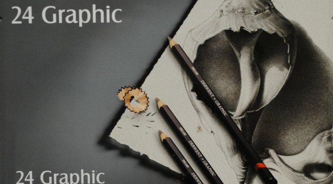
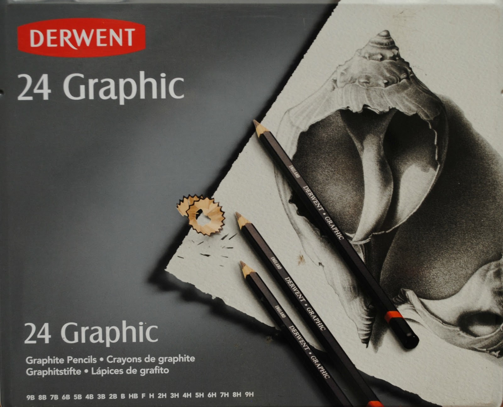
This post involves a product I’ve used most often- the Derwent 24 Graphic tin.

Here’s what the tin looks like:


As you can see from the second picture, I do use a lot of this stuff! These also come in sets of 12 and 6, and separate packs of Soft, Medium and Hard.

The pack contains 24 pencils in 20 different tones. It contains one each of 9H, 8H, 7H, 6H, 5H, 4H, 3H, H, F, B, 3B, 5B, 6B, 7B, 8B and 9B, and two each of 2H, HB, 2B and 4B (the latter being most commonly used tones).

Below is a swatch of each tone, so you can see how they look when used.

As is visible, there is a good range of tones, right from the harder (lighter) shades to the more softer (darker) ones. The very hard ones, 9H-6H, seem a bit scratchy to use at first, but they do get smoother as you apply more friction. On the other hand, the very soft ones, 6B-9B, can be extremely crumbly if too much pressure is applied. This is great when you need to blend them out- the graphite dust allows for a stronger tone- but it also means that the darker tones need to be sharpened more often. The rest of the pencils, however, are really good in terms of consistency and durability.

How well do they blend?

Ease of blending is a very important criterion for me to judge a set of pencils on. The swatch shows how similar consecutive tones are, and that means they’ll blend well into the next darker or lighter shade. However, I never have the patience to use all the shades on a single drawing. No-one does! So we resort to the addictive substances of the art world- blending stumps. (Or tortillions. Whatever floats your boat!).

Here’s a picture of some of my most commonly used tones and how they blend:

As you can see, the 5H/2H and HB/2B transitions are smooth. The 2H/HB one, however, needs a bit more work. This is where you see the difference between harder and softer graphite.

Another thing I’ve noticed is that, though most tones blend seamlessly into each other, a huge chunk of the graphite gets lifted off the paper, and I need to add at least three layers of graphite to achieve a solid tone! I can’t quite figure out why this is- I’ve tried using different types of paper and different blending tools, but the condition prevails. This isn’t a major issue, though- the option to build up colour in exactly the areas you need to is quite a gift sometimes; the repetitive action can get frustrating at other times is all.

How well does it erase off?

Another very important criterion is erasability. I prefer pencils that erase well, leaving no stains on the paper, so that mistakes don’t leave evidence and ruin the entire artwork! So here’s a picture of how well these babies vanish.

Obviously, the darker the tone, more difficult it gets to erase completely, but I’m rather impressed at how well the 4B erased off. True, it took a couple of tries, but that is to be expected, given how thick a layer of graphite I applied.

On a side note, it can be quite helpful to keep a piece of textured paper handy when erasing large quantities, since erasers tend to get useless after a while and the accumulated graphite needs to be scraped off, so to speak.

Anyway, my point is, the Graphic pencils are very good in terms of erasability. I used a hard eraser here, of course, but they lift off just as easily with kneaded erasers- rather useful when you’re bored and want to create polka dots!

Prices and Comparisons!

Admittedly, my tin was a gift from a family friend (handy, having contacts who love your work!) but prices online range from £24.99 to £29.64, from what I’ve seen. Yes, they are a bit expensive, but they are also durable and last a very long time. I’ve been using this set for over a year and a half, and I can easily use it for a few years more. A good investment, if you ask me.

If you’d rather spend lesser on pencils, though, here are a few comparisons:


The alternatives I used were lead sticks on my clutch pencils.
Faber Castell do lead refills between £2.50 to £4.22, and I can’t quite figure what brand of 2B lead I use, but it cost me less than £0.50! I’ve put a picture below so you can see. I just picked them up at the local art store because I used so much 2B, I grew tired of sharpening!


At times, I prefer the clutch pencils purely due to their precision, but in terms of finish, they’re quite the same.
Next, I compared 8B pencils by Derwent and Staedtler (Mars Lumograph).
The Staedtler one is obviously much darker. It works well as an alternative to a black colour pencil, but I’m not a fan of it. True, it gives a very opaque, even glossy, finish, but it doesn’t blend half as well, and using it on paper gives me that creepy nails-on-a-chalkboard feeling. Annoying, to say the very least! It works quite well if sharpened to a fine point, though. Anyway, the Staedlter one costs a little over £0.60, so if you’re looking to save and don’t mind a sketchy feel and constant sharpening, I’d say go for it!
So, to sum up, here are a few ratings from 0 to 10, 10 being the best at a particular aspect:
Price: 5.0/10.0 Expensive, but possibly worth it, given the good quality and durability.
Range of tones: 9.0/10.0 An impressive range. Very handy when it comes to high contrast pieces.
Finish: 8.5/10.0 They work well on most kinds of paper and adjust to the grain of the paper impressively.
Blending: 7.0/10.0 Could blend a little better between shades that are farther away, and could stick to the paper a bit better!
Erasability: 8.0/10.0 Very dark tones leave stains, of course, but most erase off very clean.
Final Verdict: 7.5/10.0
A worthwhile investment, if you’re looking to draw a lot and for a long time, and if you’re as picky about quality as I am!
Finally, some pieces where I’ve used these:
(I used the Staedtler 8B to do the background of the first one, so you can see just how dark it looks!)


So there’s my first review! I’ve tried to be as thorough as I could, but do feel free to point out anything I may have missed out on. Also, have you used these, and if so, how well do they work for you?
I hope this review was helpful, and if you do try these out, let me know how it went for you!
Thanks for reading, and have an amazing week!
-S.